
Water Crisis Color Campaigns


Pantone and charity: water Launch a Impactful Water Crisis Campaign
Grace Mahas — March 24, 2022
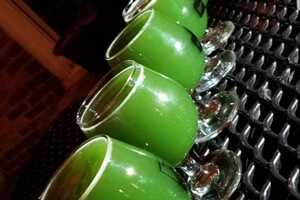
In recognition of World Water Day, Pantone, the recognized color brand, recently teamed up with charity: water to launch a striking water crisis campaign, dubbed 'The Color of Dirty Water.' The new initiative highlights the fact that over 771 million people across the globe do not have access to clean water, and are forced to drink the mirky water displayed in the campaign. As described by the non-profit, many communities must live with water that is mustardy yellow, milky gray, and forest green.
“Color is the ultimate communications tool. It doesn’t simply convey important information; it also has the power to create feelings and even actions,” Lindsay Scheinberg, social media lead at Pantone, said in a statement. “This is why we strive to use the Pantone brand and colors to raise awareness of important issues in the world whenever we can. We’re very happy to work with charity: water to spread awareness of, and show support for, the millions of people around the world who lack basic access to clean and safe drinking water.”
Charity: water is asking people to visit its website to choose a shade that represents the drinking water in their communities to help drive home the campaign's message. Through the corresponding shade, visitors can discover how the non-profit has changed the life of someone. These stories are intended to inspire visitors to become involved, starting with a donation.