
Interactive Air Quality Maps


BreezoMeter's New Map Tool Provides Local Pollution Data
Laura McQuarrie — February 22, 2017
Air pollution data provider BreezoMeter recently launched a new interactive air quality map that helps people check local conditions in the same way that they might receive a report on the weather.
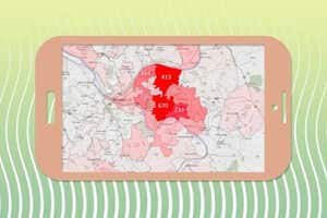
With the interactive map, users are able to view forecasts hourly on air pollution data via color-coded heat maps. What's more impressive is that a user is even able to enter a specific address in order to get pollen analytics, previously recorded air quality data and any relevant health recommendations based on real-time conditions.
As one might suspect, large cities like London, Paris and New York have "Moderate Air Quality" conditions, which are given a score to match, while a place like New Delhi is mapped entirely in red and gets a report of "Poor Air Quality."